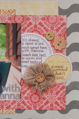
Hi everyone! Deanna here with you to share with you this month's Designer Showcase.One thing I really like to do when I create is to layer different patterns of paper so that they all pop in their own way. Here I used several tone-on-tone paper, some more subtle than others, to create the stacked layers. I chose the colors based on my daughter's dress, and let them play off each each other. I choose my patterns based on the scale of the pattern too. You'll notice that I chose a fairly large damask pattern then a smaller scaled leaf pattern. Both of those are grounded by a barely visible tone-on-tone neutral. Also to save paper, I used paper strips and tucked them beneath other papers rather than using whole sections that would be mostly covered up.
While layering rectangles and square is a lot of fun and mixing the patterns gives a lot of visual interest, it can also make your overall design look really boxy and stale (in my opinion). So to remedy that issue, I chose to use the circular journaling spots to break up all those straight lines and edges. I also intentionally used the color white to make a visual triangle around my photo.
Hope you enjoyed a little insight in to my design "thoughts". I know everyone's process is different, of course, but now you know why a do a some little things that I do.


0 comments:
Post a Comment